Cover Process: Battalion
Building a bat for Halloween

We’re doing a Halloween Special — Battalion and Ten Poets Spend the Night at a Vampire’s Castle for £13. Seemed like a good time to revisit the cover design of Battalion, the fourth and final in the Headbooks series, and the only book that will ever ask you to bioengineer a bat face by sticking sweet wrappers to its pages.
Oddly enough, the first cover was drafted four of five years prior to its release — we knew we wanted to make some kind of bat book long before we had the idea for the series. The original notion was that we’d get one poem and one illustration for each UK species of bat, but having set these wheels in motion, we came to the conclusion that there wouldn’t be enough to differentiate the poems — not unless we came up with some stricter formulation.
The colour palette was decided at these early stages, and I experimented with two concepts: bat with soundwaves emanating from mouth (above), and bat in close-up silhoutette with moon for eye (below).
I preferred soundwaves, but once we knew the cover should follow the formula established by Aquanauts and Bad Kid Catullus, it looked like moon-eye was the one to go with. Still, surely I could incorporate the soundwaves somehow? And also keep that blancmange pink?
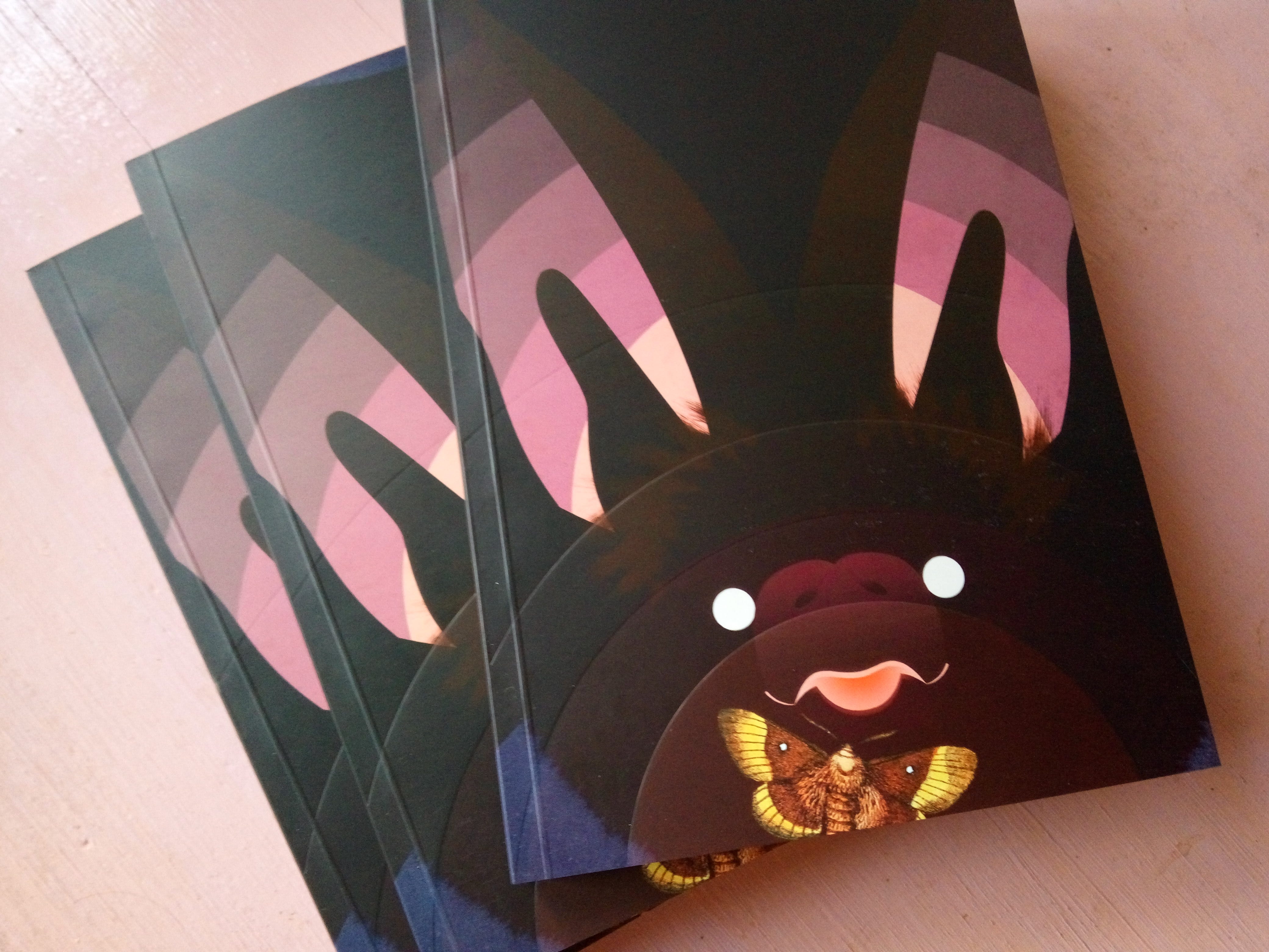
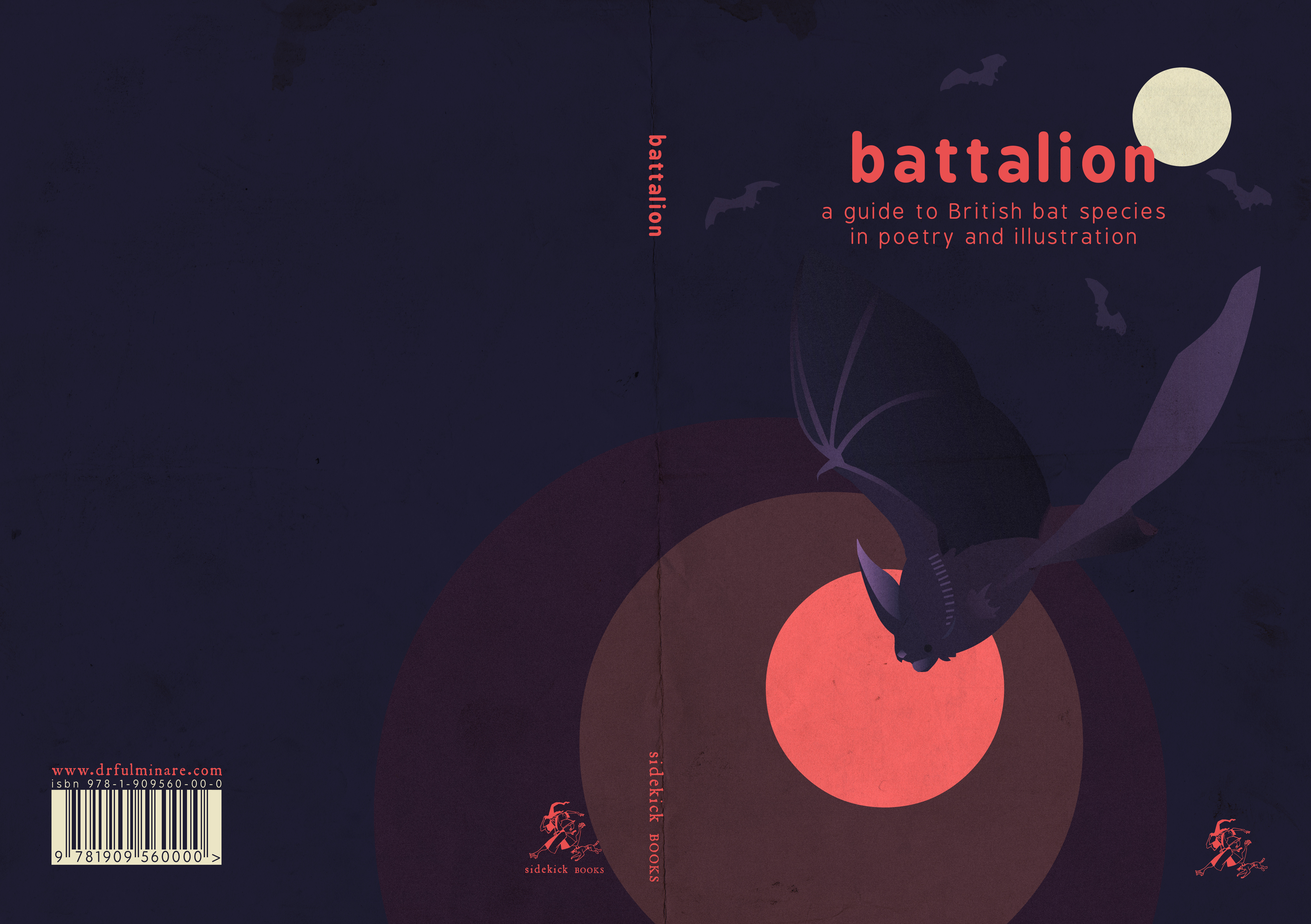
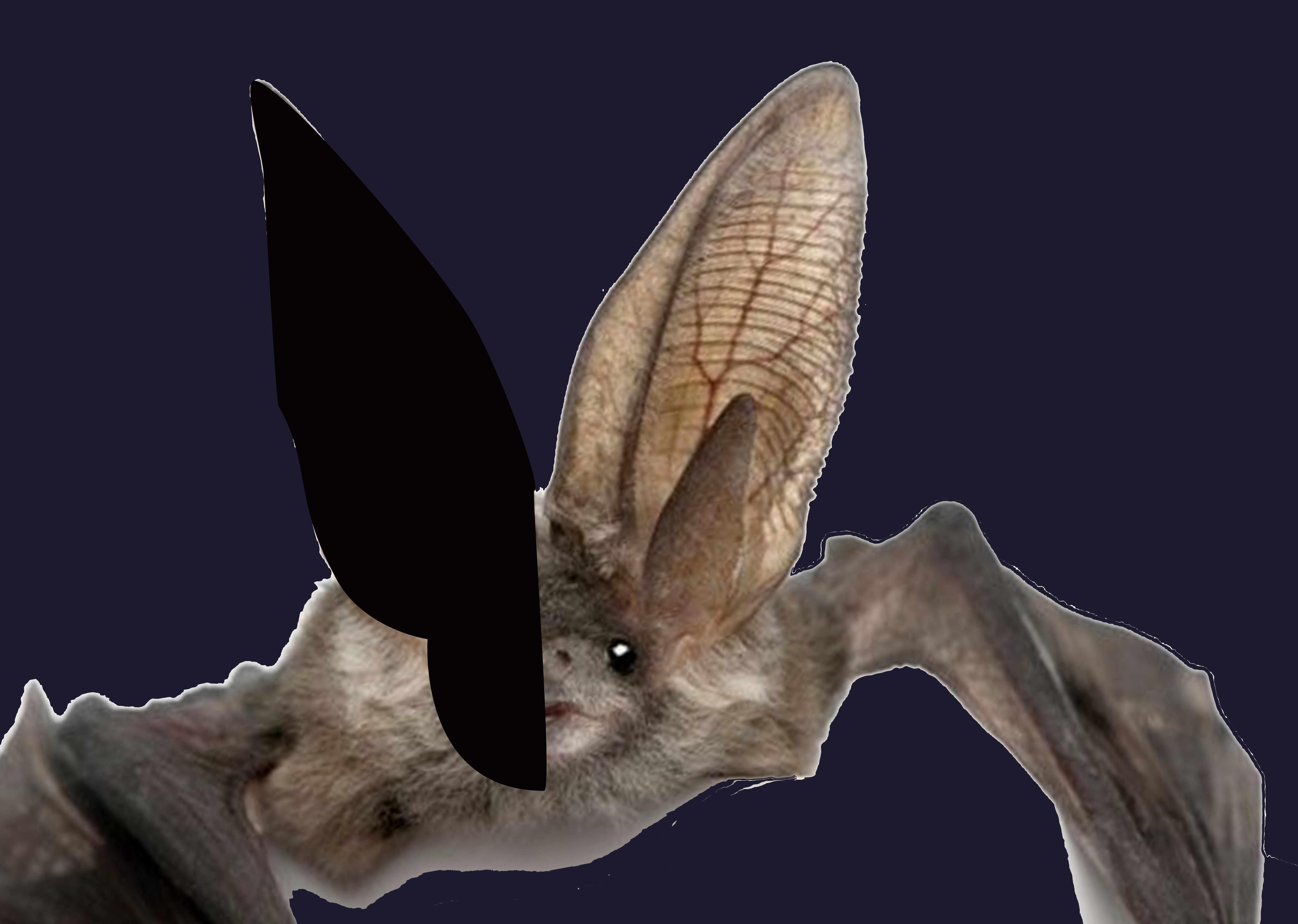
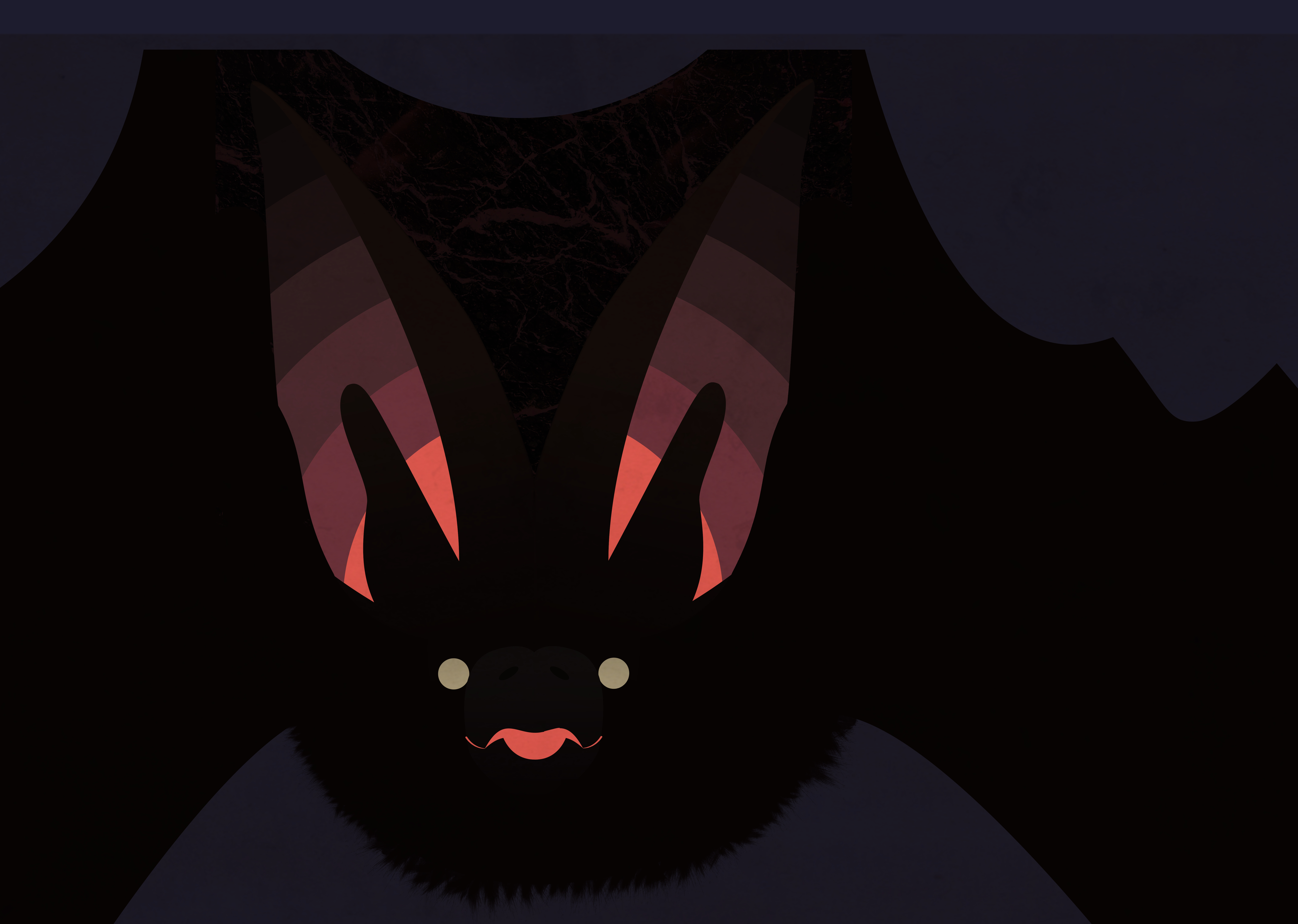
The Headbook covers have flaps, so the design needed to be off-centre — wide enough to go from the 1-1.5cm spine, across the front and around onto the front flap. For silhouetting purposes, the brown long-eared bat made the most sense. I can sketch, using references, but for a collage/digital cover it’s easier to paste a reference straight in and trace it roughly with vector paths. Hmmm. Near-black against murky blue — definitely needs more colour.
So onto the most inspired part: the ears, as well as containing all the pinks and purples, could suggest the soundwaves, at the same time as the lateral creases in the bat’s pinnae. The tragi (those front-parts) slightly get in the way, but help make it more recognisable as a bat.
You’ll notice in the image below I’m using a framing layer, which I can toggle between transparent and opaque, to help me envisage what the final font cover will look like without spine and flap. The ears should go right to the edge of this.
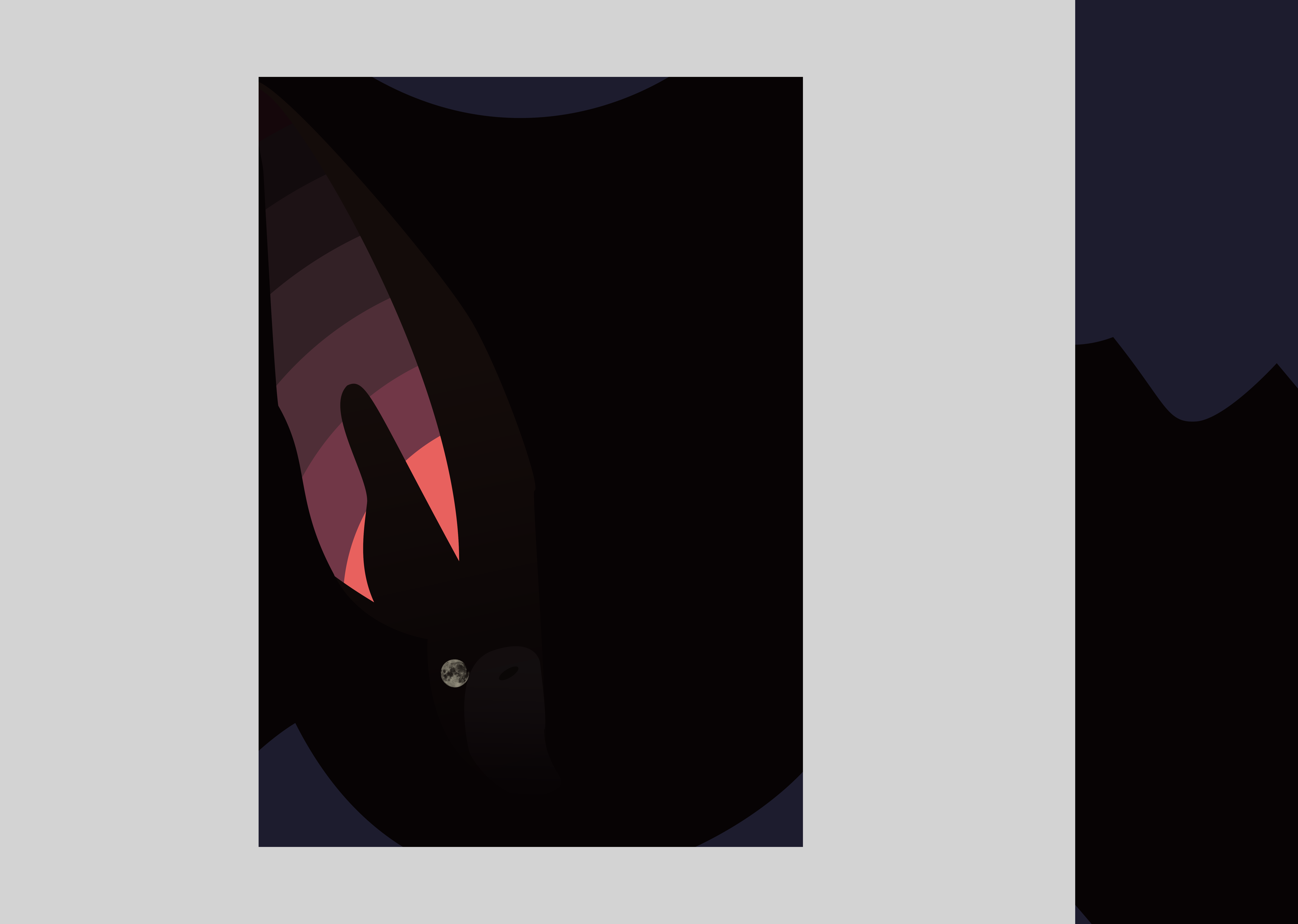
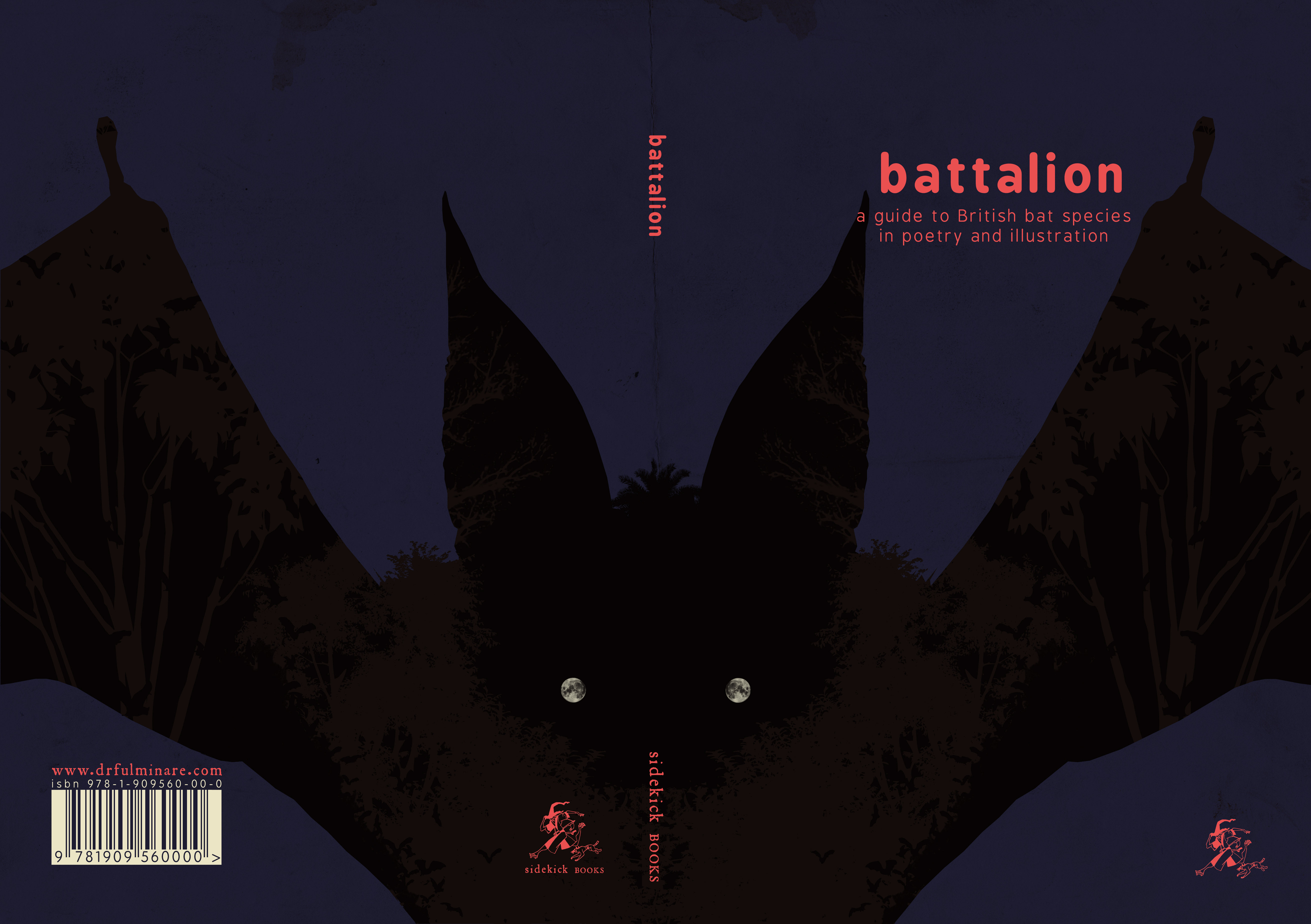
I put in the moon-eye — an actual image of the moon — but ultimately backed out of the idea. For a start, this bat, unlike the one on the draft cover, needed to have two eyes staring out of the same side of the book. There aren’t two moons. For another thing, you had to get really close to recognise it was the moon. From normal reading distance, it just looked like a dull, dirty circle.
So I replaced both eyes with bright, yellowish circles. Not biologically accurate, but necessary, if people are to understand that they’re looking at a face. Next I added the mouth — a slightly more complicated affair. Then I stood back to ponder what else was needed — maybe the most difficult part of the whole process. I’m not a very experienced cover artist, and the line between basic/unfinished and elegant/simple is one I often struggle to locate.
I decided to turn the brightness up, put some fur in the ears, add a snout, give the backdrop some texture and give the bat a moth to snag. All of these could be mistakes — I’m still not 100% sure of any of them! But the collage element that was key to the Headbooks’ visual identity was missing, so the moth — or something like it — was needed.
Perhaps the most messy decision I made at this stage was to add in more soundwaves. Aquanauts and Bad Kid Catullus had spot-glossed covers, and the upcoming No, Robot, No! was going to have some hotfoiling, so we decided Battalion should have debossing. The resulting texture is very attractive, but I wish I’d made those soundwaves line up with the lines in the ears.
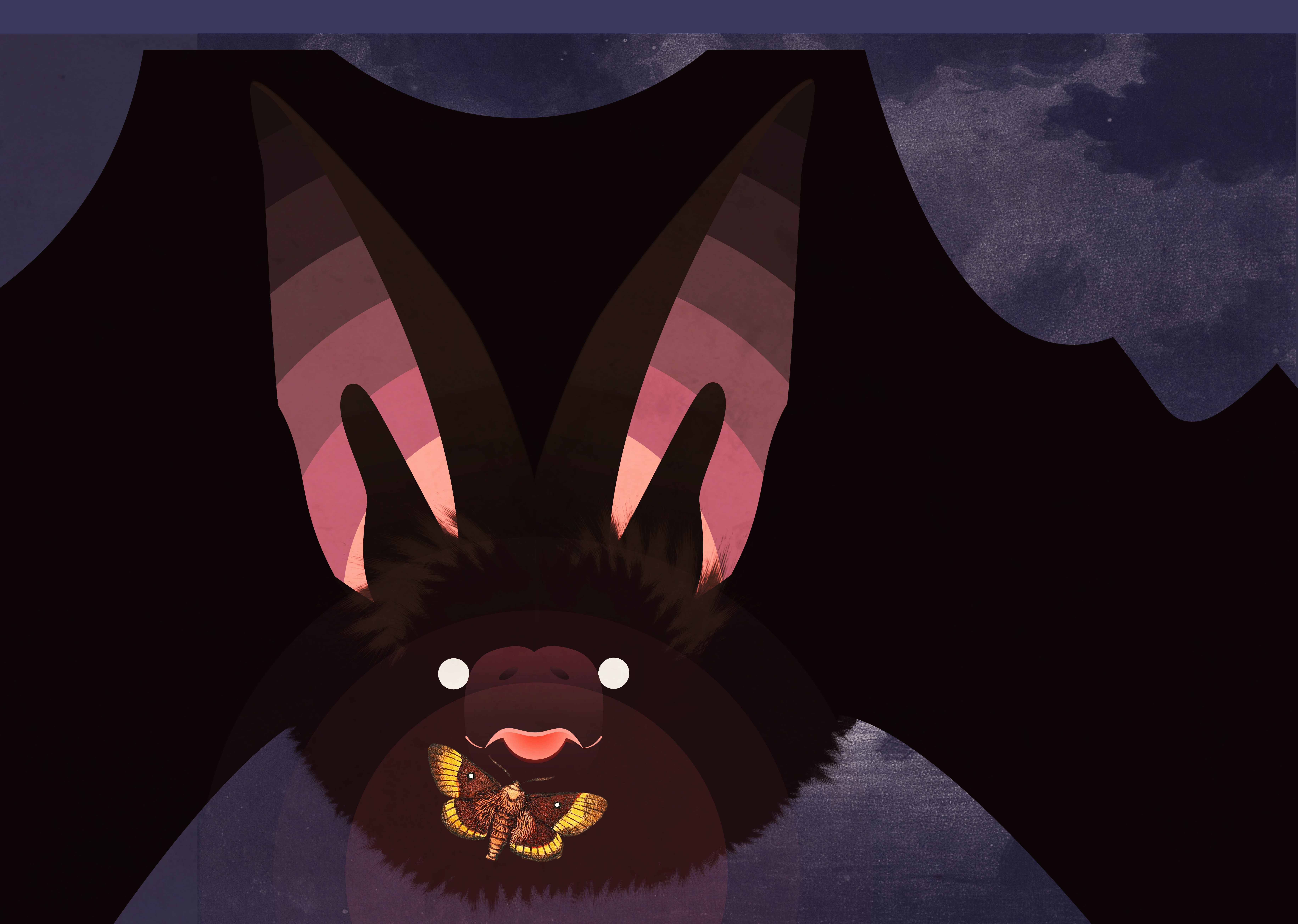
The first printing of the final cover came out too dark, but we were quickly able to get that fixed, and the end result lines up nicely with the rest of the series. Battalion is the last Headbook. We would have liked to continue going — there was so much that we learned through the process, and so much we could improve upon — but full-colour visual poetry books aren’t really feasible without an external source of income, so it was onto the next idea.